
Introduction
In today’s data-driven world, businesses generate massive amounts of data every second. However, raw data alone does not create value. The real power lies in presenting that data in a meaningful and visually engaging way. This is where Data Visualization plays a crucial role.
Data visualization transforms complex datasets into charts, graphs, dashboards, and interactive visuals that make patterns, trends, and insights easy to understand. Whether you’re a data analyst, business owner, or student, mastering data visualization tools and techniques is essential for effective decision-making.
What is Data Visualization?
Data Visualization is the process of converting raw data into graphical formats such as charts, graphs, maps, dashboards, and infographics to make information easier to understand and interpret.
In simple words, it is the visual storytelling of data.
Instead of analyzing thousands of rows in a spreadsheet, data visualization allows users to identify patterns, trends, and insights through visuals.
Data visualization is the graphical representation of data using visual elements like:
- Charts
- Graphs
- Maps
- Dashboards
- Infographics
It helps people understand complex information quickly by identifying:
- Trends
- Patterns
- Relationships
- Outliers
Instead of reading long spreadsheets, decision-makers can interpret visual data within seconds.
Why Data Visualization is Important?
1. Simplifies Complex Data
Large datasets can be overwhelming. Visual representation makes information easy to digest.
2. Improves Decision Making
Clear visuals help businesses make faster and smarter decisions.
3. Identifies Trends and Patterns
You can quickly spot sales growth, customer behavior, or performance issues.
4. Enhances Communication
Data storytelling becomes powerful when supported by visuals.
5. Saves Time
Visual dashboards reduce the need for lengthy reports.
Types of Data Visualization Techniques
Understanding the right technique is as important as choosing the right tool.
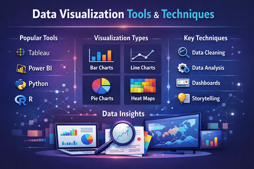
1. Bar Charts
Used for comparing categories.
Example: Comparing sales across different regions.
2. Line Charts
Best for showing trends over time.
Example: Monthly revenue growth.
3. Pie Charts
Used to show proportions or percentage distribution.
Example: Market share distribution.
4. Scatter Plots
Shows relationship between two variables.
Example: Advertising spend vs Sales.
5. Heat Maps
Displays data density or intensity using color variations.
Example: Website click tracking.
6. Histograms
Shows frequency distribution of numerical data.
7. Area Charts
Similar to line charts but emphasize magnitude.
8. Tree Maps
Displays hierarchical data using nested rectangles.
9. Geographic Maps
Used for location-based data visualization.
Top Data Visualization Tools
There are many tools available depending on skill level and business needs.
1. Microsoft Excel
- Beginner-friendly
- Basic charts and pivot tables
- Widely used in businesses
Best For: Small-scale data analysis.
2. Tableau
- Advanced analytics
- Interactive dashboards
- Drag-and-drop interface
Best For: Business intelligence and enterprise reporting.
3. Power BI
- Developed by Microsoft
- Real-time dashboard creation
- Strong integration with Excel
Best For: Business reporting and analytics.
4. Google Data Studio (Looker Studio)
- Free and cloud-based
- Easy sharing and collaboration
Best For: Marketing and web analytics reporting.
5. Python (Matplotlib, Seaborn, Plotly)
- Highly customizable
- Used by data scientists
- Suitable for advanced analysis
Best For: Technical users and automation.
6. R (ggplot2, Shiny)
- Statistical visualization
- Advanced data modeling support
Best For: Academic and statistical analysis.
7. D3.js
- JavaScript library
- Highly interactive web-based visualizations
Best For: Custom web applications.
Modern Trends in Data Visualization
1. Interactive Dashboards
Users can filter and explore data dynamically.
2. Real-Time Visualization
Used in stock markets, IoT systems, and monitoring tools.
3. AI-Powered Insights
Tools automatically detect trends and anomalies.
4. Mobile-Friendly Visualizations
Responsive dashboards for smartphones and tablets.
5. Data Storytelling
Combining narrative with visuals to make data impactful.
Data Visualization Techniques
Data Visualization Techniques refer to the different graphical methods used to represent data effectively.
Each technique is selected based on:
- Type of data (categorical or numerical)
- Purpose of analysis
- Target audience
- Business objective
Common techniques include:
- Bar charts for comparison
- Line charts for trends
- Pie charts for proportions
- Scatter plots for relationships
- Heat maps for intensity
Core Components of Data Visualization
A complete data visualization system consists of:
1. Data Source
Raw data collected from databases, surveys, APIs, or spreadsheets.
2. Data Processing
Cleaning, transforming, and organizing data.
3. Visual Encoding
Converting data into visual elements like:
- Position
- Color
- Size
- Shape
4. Presentation Layer
The final chart, graph, or dashboard shown to users.
Purpose of Data Visualization
The main purpose of data visualization is to:
- Simplify complex data
- Improve clarity
- Enhance decision-making
- Increase engagement
- Support strategic planning
It bridges the gap between technical data analysis and business understanding.
Common Mistakes to Avoid
- Overloading dashboards with too much data
- Using 3D charts unnecessarily
- Misleading scales on axes
- Poor color contrast
- Ignoring audience understanding
Applications of Data Visualization
Data visualization is widely used in:
- Business Intelligence
- Healthcare Analytics
- Financial Analysis
- Marketing Campaign Analysis
- Supply Chain Management
- Government Reporting
- Education and Research
- Web Design & Development
Future of Data Visualization
The future of data visualization lies in:
- AI-driven analytics
- Augmented reality (AR) dashboards
- Voice-controlled analytics
- Automated insight generation
- Integration with big data platforms
As data continues to grow, visualization tools will become smarter, more interactive, and more accessible.
Conclusion
Data visualization is not just about creating charts — it is about transforming data into actionable insights. With the right tools and techniques, businesses and professionals can unlock the true potential of their data.
Whether you are using Excel for basic reporting or advanced tools like Tableau and Python for complex analytics, mastering data visualization will give you a competitive edge in today’s digital world.
Understanding both the tools and the techniques ensures you can communicate data effectively and make smarter decisions.